Article Text

Abstract
Background Dashboards are visual information systems frequently employed by healthcare organisations to track key quality improvement and patient safety performance metrics. The typical healthcare dashboard focuses on specific metrics, disease processes or units within a larger healthcare organisation. Here, we describe the development of a visual analytical solution (keystone dashboard) for monitoring an entire healthcare organisation.
Methods The improvement team reviewed and assessed various data sources across the organisation and selected a group of patient and employee related metrics that afforded a broad overview of the organisation’s well-being. Metrics spanned the organisation and included data from patient safety, quality improvement, human resources, risk management and medical staff affairs. Each metric was assigned a numeric weight that correlated with its impact. A visual model incorporating the various data fields was then constructed.
Results The keystone dashboard incorporates a data heatmap and density visualisation to emphasis areas of higher density and/or weighted values. The heatmap is used to indicate the weight/magnitude of each metric within a data range in two dimensions: location and time. The visualisation ‘heats up’ depending on the combination of counts events and their assigned impact for the reporting month. Most data sources update in near real time.
Summary The keystone dashboard serves as a comprehensive and collaborative integration of data from patient safety, quality improvement, human resources, risk management and medical staff affairs. This visual analytical solution incorporates and analyses metrics into a single view with the intent of providing valuable insight into the health of an entire organisation. This dashboard is unique as it provides a broad overview of a healthcare organisation by incorporating key metrics that span the organisation.
- Healthcare quality improvement
- Decision making
- Information technology
- Management
- Performance measures
Data availability statement
No data are available. Not applicable.
This is an open access article distributed in accordance with the Creative Commons Attribution Non Commercial (CC BY-NC 4.0) license, which permits others to distribute, remix, adapt, build upon this work non-commercially, and license their derivative works on different terms, provided the original work is properly cited, appropriate credit is given, any changes made indicated, and the use is non-commercial. See: http://creativecommons.org/licenses/by-nc/4.0/.
Statistics from Altmetric.com
WHAT IS ALREADY KNOWN ON THIS TOPIC
Dashboards are visual information systems that are widely used by healthcare organisations for tracking key performance metrics. Most dashboards focus on a specific location, disease process or safety metric within a larger organisation.
WHAT THIS STUDY ADDS
The current study offers insight into the development of a broad, system-level visual analytical solution that affords an overview of the performance of the entire organisation while preserving the ability to drill down on specific locations.
HOW THIS STUDY MIGHT AFFECT RESEARCH, PRACTICE OR POLICY
The study offers valuable insight into how organisations can leverage existing siloed data streams into a unified, system level metrics for monitoring organisation health and to guide decision making at the organisational level.
Background
Healthcare organisations face increasing scrutiny to perform at the highest levels of safety and quality.1 In the drive to maintain quality and high performance, healthcare organisations frequently use dashboards to track and measure key performance indicators to gauge the organisation’s performance and guide decision making.2 Dashboards are visual information systems that disseminate data in a format that is easily interpreted by end users.2 3 A typical dashboard will display an overview of an organisation’s key performance measures to inform and guide decision making.2 Dashboards containing key quality improvement and patient safety performance metrics are frequently employed by healthcare organisations to guide decisions and improve the organisation’s structure, process and outcomes.3 Most dashboards focus on specific quality and safety metrics and area(s) within a healthcare organisation (eg, hospital-acquired infections within a given unit), process and performance quality metrics (eg, wait times) or human resource metrics (eg, staff turnover).3 The use of quality and safety dashboards by healthcare organisations has demonstrated improvements in key quality and safety metrics including infection rates,4 5 medication errors6 and fall prevention.7
The impetus for the quality improvement project followed the recommendations from external consultants brought in by the organisation. The external consultants identified three broad opportunities for improvement within the organisation. First, the organisation’s quality and safety data were collected in silos which impeded the organisation’s ability to respond to events in a timely manner. Second, information regarding quality and safety data did not flow optimally, that is, upward, downward and horizontally, leading to a lack of transparency within the organisation. Finally, the organisation did not have a unified strategy for monitoring and responding to signals within the data received. Following the recommendation of the external consultants, the organisation turned to the Centre for Paediatric Data Science to develop solutions to address the identified areas of concern.
The goal of the current project was to develop a ‘keystone’ dashboard (KD) that would serve as a collaborative and comprehensive integration of the various data streams emanating from within the organisation to provide an overview of the organisation’s health. We describe in detail the iterative process for the development of a system level visual analytical solution (KD) for monitoring the performance of a healthcare organisation.
Methods
Setting
The Johns Hopkins All Children’s Hospital is a 259-bed paediatric academic healthcare system located in St. Petersburg, Florida. The hospital leverages an integrated electronic health system (EHR) to collect and manage personal health information. While this system is robust, the hospital needed a reliable, efficient, valid method of integrating data from other patient and staff/employee-related sources.
Improvement team
The core team was formed to respond to recommendations by external consultants. The team included executive leaders, clinical champions and informaticists.
Development process
A data assessment was completed by our improvement team and multiple domains were identified for inclusion in the model: patient safety, quality improvement, human resources, risk management and medical staff affairs (described below). Within each of these domains, at least one data source was chosen for integration. Among the domains, 21 measures were identified for exploration during the data assessment. After assessment, there were seven chosen data sources that had high integrity and accuracy. Data were obtained from hospital technology systems and third-party vendors. Our team identified data stewards and explored the fields collected and tracked in each source then developed a data dictionary (table 1).
Dictionary of data fields incorporated into keystone dashboard
Data sources
Patient safety and quality improvement
Initial patient safety and quality improvement data sources included voluntary event reports of concerns submitted by employees (HERO, Johns Hopkins, Baltimore, Maryland, USA). Serious safety events were incorporated into the model in March 2021 once a data stream was developed for that source consisting of a internal REDCap database (Vanderbilt University, Nashville, Tennessee, USA). The Safety Culture Assessment survey was investigated as a source for inclusion however it was excluded since responses were collected biannually, and we wanted data source to be more timely and actionable.
Human resources
Turnover data obtained from a third-party vendor (HR Acuity, Florham Park, New Jersey, USA) were identified as a key source of information for the model. Exit Interviews were investigated as another source, however, the qualitative nature of the data precluded the inclusion of this data source.
Risk management
Complaints and grievances are collected in a third-party vendor database and are reviewed by risk management. These events are submitted by patients and families. Complaints are resolved the same day while Grievances take more time to resolve. An additional risk management data source is our ethics and compliance hotline Speak2Us. Speak2Us is a hotline managed by a third party that permits both employees and patients/families to report clinical concerns as well as inappropriate workplace behaviour.
Medical staff
Our institution’s vice-president for medical affairs (VPMA) manages an internal REDCap database to track medical staff concerns that require investigation. Details of the concern, substantiation status and outcomes are collected.
Most data sources update in near real time. The heatmap updates on the 15th of the month with the previous month’s data. This allows sufficient time for data stewards and teams to review data and assign outcomes.
Data visualisation
When considering the best visual analysis for these varied data sets, we quickly decided that a simple count of submitted events would provide a very narrow view of the well-being at our hospital. We met with subject-matter experts in each of these domains and data sources to determine the weight or impact of each of these events on their department and the larger organisation. Various fields were identified to weigh events and a data dictionary was developed. For example, Speak2Us hotline reports are reviewed and then tagged as substantiated, unsubstantiated or insufficient information. These values were assigned numeric weights in the model that correlated to their impact. Some other data sources such as grievances did not have a process for tracking outcomes, so we worked with risk management leaders to develop a weekly review process for events where events were tagged with an outcome for the investigation. Since these data sources and domains were not tracked in a standardised format, we developed a service location lookup table. For example, ‘emergency centre’ could be tracked as ‘EC-emergency centre’ in one database, while another source tracked the same service as ‘emergency department’. This standardised nomenclature allowed us to consolidate the various sources into consistent service buckets.
For each data source, we created derived standardised values from the combination of event counts and impact weights. The final data set is the result of integrating all data sources and calculating the derived values. These final values were displayed using the Tableau business intelligence tool (Tableau Software, Seattle, Washington, USA). Data heatmap and density visualisations are used to add emphasis to areas of higher density or weighted values, as they are an efficient way to display generalised point pattern locations. The heatmap is used to indicate the weight/magnitude of each point within a data range in two dimensions: location and time. The visualisation ‘heats up’ depending on the combination of counts events and their assigned impact for the reporting month.
Results
In July 2021, an executive high-impact summary view was released that displays the most recent high impact events and their associate service location (ie, displays only substantiated Speak2Us reports, high harm voluntary patient safety/quality event reporting). This provides leadership a high-level overview of the organisation to determine where and what impactful events have occurred in the last month. Figure 1A displays the heatmap over nearly a 5-year period. The data is grouped by 1 services by 2 month/year. Stacked bar charts 3 with reference lines for important events display counts of events. The model is interactive and filterable by 4 service and 5 data source. The legend 6 provides context for the variation in colour in each mark.
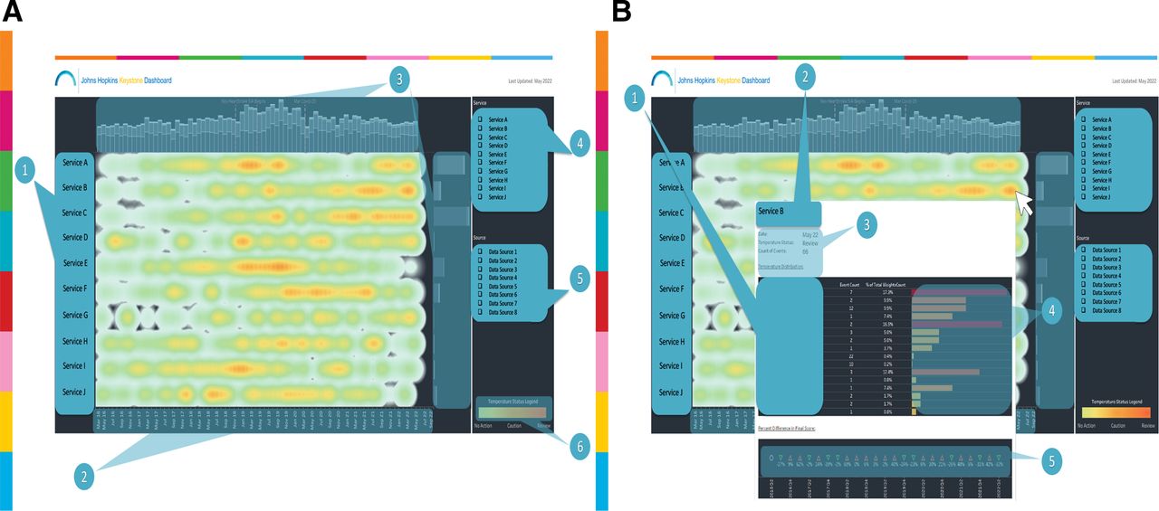
Keystone heatmap. (A) Heatmap providing a 5-year organisational overview. (B) Heatmap showing user tool for drilling down on specific areas of the heatmap. 1 Services, 2 Month/year, 3 Stacked bar charts; counts of events split by data source, 4 Service filter, 5 Data source filter, 6 Legend. Heatmap sorted by highest score to lowest score by service. Services and data source names have been removed from the view for deidentification purposes.
The KD allows users to drill-down into event-specific, granular data for each source (incorporated into the application in September 2020). Figure 1B exhibits the tooltip 1 that appears when a user hovers over a specific mark on the KD (figure 1). The tooltip displays 2 the service, date, count of events and an alert based on the ‘heat’ of the mark (review, caution, no action) that matches the legend. 3 Baseline median values were calculated to determine these thresholds. The tooltip also displays a bar graph 4 grouped by data source and outcome where users can quickly see the breakdown of where the ‘heat’ is coming from. A time series of percent differences in final score 5 appears towards the bottom of the tooltip to trend the changes in heat for the service.
In addition to the high level heatmap view, the KD also provides a more detailed ‘footprint’ view of high and low impact events. Figure 2A displays the footprint map over nearly a 5-year period showing individual ‘hotspots’ within the organisation, which allows users to focus on areas of concern. The data are grouped by services (1) and by month/year(2). Stacked bar charts (3) with reference lines for important events display counts of events. The model is interactive and filterable byservice (4) and data source (5). The legend 6 provides context for the variation in colour in each mark.

Keystone heatmap footprint. (A) Footprint providing a detailed 5-year organisational overview. (B) User tool for drilling down on specific areas of the keystone footprint. 1 Services, 2 Month/year, 3 Stacked bar charts; counts of events split by data source, 4 Service filter, 5 Data source filter, 6 Legend. Heatmap sorted by highest score to lowest score by service. Services and data source names have been removed from the view for deidentification purposes.
The footprint view of the KD allows users to drill-down into event-specific, granular data for each source (incorporated into the application in September 2020). Figure 2B exhibits the tooltip (1) that appears when a user hovers over a specific mark on the footprint map (figure 2). The tooltip displays the service, date, count of events (2) and an alert based on the ‘heat’ of the mark (review, caution, no action) that matches the legend (3). Baseline median values were calculated to determine these thresholds. The tooltip also displays a bar graph (4) grouped by data source and outcome where users can quickly see the breakdown of where the ‘heat’ is coming from. A time series of percent differences in final score (5) appears towards the bottom of the tooltip to trend the changes in heat for the service.
Discussion
The expectations of patients, payers and policy makers coupled with broad mandates including the Institute of Medicine’s (IOM) Committee on Quality of Healthcare in America and the Institute for Healthcare Improvement’s Quadruple Aim, place increasing scrutiny on healthcare organisations to deliver high-quality care and to function as high-performing organisations.8 9 These broad mandates provide healthcare organisations with goals to target but fail to provide organisations with tools, methods or even clear definitions to achieve these goals.1 The IOM provides a list of specific aims (safety, timely access, effectiveness, efficiency, equity and patient-centredness) for organisations to target but leaves it to the individual organisation to develop the methods for achieving these aims.8 The IHI’s Quadruple Aim (improving patient experiences, reducing costs, improving population health and improving the working conditions of the healthcare workforce) provides a set of goals that could well serve as the mission statement for all healthcare organisations, but like the IOM offers no clear methodology for achieving these goals. In order to meet the rising expectations, healthcare organisations need a system for measuring and managing data to guide organisational decision making.10 Prior to developing the KD, the organisation measured performance and based decision making on siloed streams of information, none of which provided a unified picture of the organisation’s overall health. The organisation measured its overall health through employee engagement survey results, Safety Culture Assessment survey results, HCAHPS (Hospital Consumer Assessment of Healthcare Providers and Systems) scores and US News and World Report rankings. These metrics, while widely used, fail to provide information in a timely manner that is actionable for organisational decision making. The KD incorporates information from patent safety, quality improvement, risk management, medical staffing and human resources, which provides the organisation with a valuable tool for working towards the IOM’s and IHI’s aims of quality.
Most, if not all healthcare organisations collect quality and safety data for the purpose of reporting to external stakeholders (eg, patients, payors, policy makers). While this method of data collection and reporting is a useful means for external agencies to measure a healthcare organisation’s performance, it is not always a useful means for the reporting organisation to drive internal performance improvement.2 The KD is unique in that it primarily focuses on data streams that measure the internal health of the organisation, most of which are not ‘reportable’ or relevant to external agencies. Although these measures may not be relevant to external agencies per se, we believe they drive the overall performance of the organisation, that is, the health of the organisation ultimately drives the quality and performance of the organisation. The KD’s focus on internal measures of organisational health serves as an early indicator of the organisation’s overall performance and allows the organisation to take early corrective measures when performance lags. This allows the organisation to be nimble and resilient in the face of dynamic challenges.
The KD allows the organisation to track several key metrics that collectively make up an organisational version of the allusive Quadruple Aim that is, improving patient experiences, reducing costs, improving population health and improving the working conditions of the healthcare workforce.9 10 This makes the KD unique as most dashboards in use by healthcare organisations tend to focus on one or two areas of the Quadruple Aim. The KD helps to prevent patient harm and improve patient experience by tracking key patient safety and quality metrics. By addressing turnover and staff attrition, the KD helps the organisation contain costs and improve the well-being of its workforce. The KD incorporates key metrics that address legal, ethical and professional operations that promote population health, patient experience and staff well-being.
Next steps
The KD serves as a model of the organisation’s performance. Although the data streams are relatively current, they represent the organisation’s past performance. The goal of the KD is to not just measure past performance but to guide decision making to ensure future performance goals are met. The next step for the KD is to shift from past performance measurement to predictive analysis and prospective modelling to guide future performance. This shift from a ‘lagging indicator’ to a ‘leading indicator’ of quality and performance has been widely adopted in other industries but has proven to be elusive in healthcare.
One of the strengths of the KD is the ability to incorporate new data streams rather seamlessly now that the model is built. There are other performance areas that are of interest to the organisation that could be incorporated into future versions of the KD. A growing area of concern to the organisation is the health of its workforce. The mental health of the healthcare workforce is a rapidly emerging threat facing healthcare organisations. To address this concern, we are exploring ways to incorporate measures of staff burnout and other markers of staff wellness into the KD.
The KD provides a measure of many performance areas currently measured by other widely used and validated healthcare performance tools. We aim to study the correlation between the KD and these other validated instruments including the employee engagement survey, Safety Culture Assessment and HCAHPS. We believe the KD will identify areas of concerns within the healthcare workforce that correlate with the employee engagement survey and Safety Culture Assessment and do so in a more timely manner permitting organisational leaders to take action to address staff concerns before reaching crisis level. Similarly, we believe that the KD will identify areas concerning our patients long before these areas are identified by the HCAPHS instrument.
Limitations
The KD is not without limitations. While the tool provides detailed macro and micro level views of organisational quality and performance, it does not permit benchmarking to other institutions. Like other performance measurement systems, the KD depends on retrospective data streams and is thus a lagging indicator of quality. Attempts were made to automate as many of the data streams that flow into the KD as possible, yet some data sources require manual validation or scoring before entry.
Summary
The Johns Hopkins All Children’s Hospital KD serves as a comprehensive and collaborative integration of data from patient safety, quality improvement, human resources, risk management and medical staff affairs. This visual analytical solution incorporates and analyses metrics into a single view with the intent of providing valuable insight into the health of both employees and patients for the leadership teams. The KD allows the organisation to identify and act on areas of concern in a timely manner. This dashboard is unique as it provides a broad overview of the health of the entire organisation by incorporating key metrics that span the organisation. By incorporating information from patent safety, quality improvement, risk management, medical staffing and human resources, the KD provides organisational leaders and decision-makers with a comprehensive performance view of the organisation. The dashboard output generates a heatmap of the organisation that permits the user to view the entire organisation, identify anomalies and drill down on specific units or departments within the organisation.
Data availability statement
No data are available. Not applicable.
Ethics statements
Patient consent for publication
Ethics approval
The quality improvement project had no direct contact with patients, families or employees.
Footnotes
Twitter @greenal11
Contributors All authors contributed to the design, conduct and preparation of the attached manuscript. Author SCW served as the guarantor for this study.
Funding The authors have not declared a specific grant for this research from any funding agency in the public, commercial or not-for-profit sectors.
Competing interests None declared.
Patient and public involvement Patients and/or the public were not involved in the design, or conduct, or reporting, or dissemination plans of this research.
Provenance and peer review Not commissioned; externally peer reviewed.