Article Text

Abstract
Background Those working in healthcare today are challenged more than ever before to quickly and efficiently learn from data to improve their services and delivery of care. There is broad agreement that healthcare professionals working on the front lines benefit greatly from the visual display of data presented in time order.
Aim To describe the run chart—an analytical tool commonly used by professionals in quality improvement but underutilised in healthcare.
Methods A standard approach to the construction, use and interpretation of run charts for healthcare applications is developed based on the statistical process control literature.
Discussion Run charts allow us to understand objectively if the changes we make to a process or system over time lead to improvements and do so with minimal mathematical complexity. This method of analyzing and reporting data is of greater value to improvement projects and teams than traditional aggregate summary statistics that ignore time order. Because of its utility and simplicity, the run chart has wide potential application in healthcare for practitioners and decision-makers. Run charts also provide the foundation for more sophisticated methods of analysis and learning such as Shewhart (control) charts and planned experimentation.
- Quality improvement
- run chart
- statistical process control
- time order
- visual display of data
- healthcare quality improvement
- statistical process control
Statistics from Altmetric.com
- Quality improvement
- run chart
- statistical process control
- time order
- visual display of data
- healthcare quality improvement
- statistical process control
The skills associated with using data for improvement vary widely among those working to improve healthcare. We describe a simple analytical tool commonly used by professionals in quality improvement, but underutilised in healthcare—the run chart.1 For those health professionals that use run charts, they provide a valuable source of information and learning for both practitioner and patient. The following scenario described by Neuhauser and Diaz2 provides one example of the simplicity of run charts and their potential for wide application in healthcare:Susan Cotey is a diabetes educator at Huron Hospital in Cleveland, Ohio. She gives out graph paper to elderly diabetic patients who live in the most impoverished part of her city. She uses a self-help book designed specifically for her patients. Each patient gets a copy. She asks them to plot their blood sugar measures over time, connect the dots and bring their graphs in to small discussion groups of similar patients who share their experience and learn about diabetes self-management (diet, exercise, weight control). Nearly every patient brings in their graph. The large majority of patients improve their diabetic control. This hospital has made diabetes management a centre of its healthcare mission.
The use of run charts by these patients with diabetes summarises the spirit of our paper—the run chart has a role to play in healthcare improvement work.
Although many healthcare professionals now recognise the value of statistical process control methods, applications and tools in improving the quality of care, much of this focus in the healthcare improvement literature is on Shewhart (control) charts and their various derivatives (such as cumulative summation charts and funnel plots).3 Very little has been written about the use and application of run charts.
The run chart allows us to learn a great deal about the performance of our process with minimal mathematical complexity. Specifically, it provides a simple method to determine if a process is demonstrating non-random patterns, what we term a ‘signal’. By focussing on the time order that data are collected, the run chart can be applied when traditional methods to determine statistical significance (t-test, chi-square, F test) are not useful. Important uses of the run chart for improvement activities include the following4:
Displaying data to make process performance visible
Determining if changes tested resulted in improvement
Determining if we are holding the gains made by our improvement
Allowing for a temporal (analytic) view of data versus a static (enumerative) view
Displaying data on a run chart is often the first step in developing more complex Shewhart (control) charts4 5 and in the design of planned experiments.6 7 In this paper, we briefly outline the construction, interpretation and use of run charts.
Definition and construction of a run chart
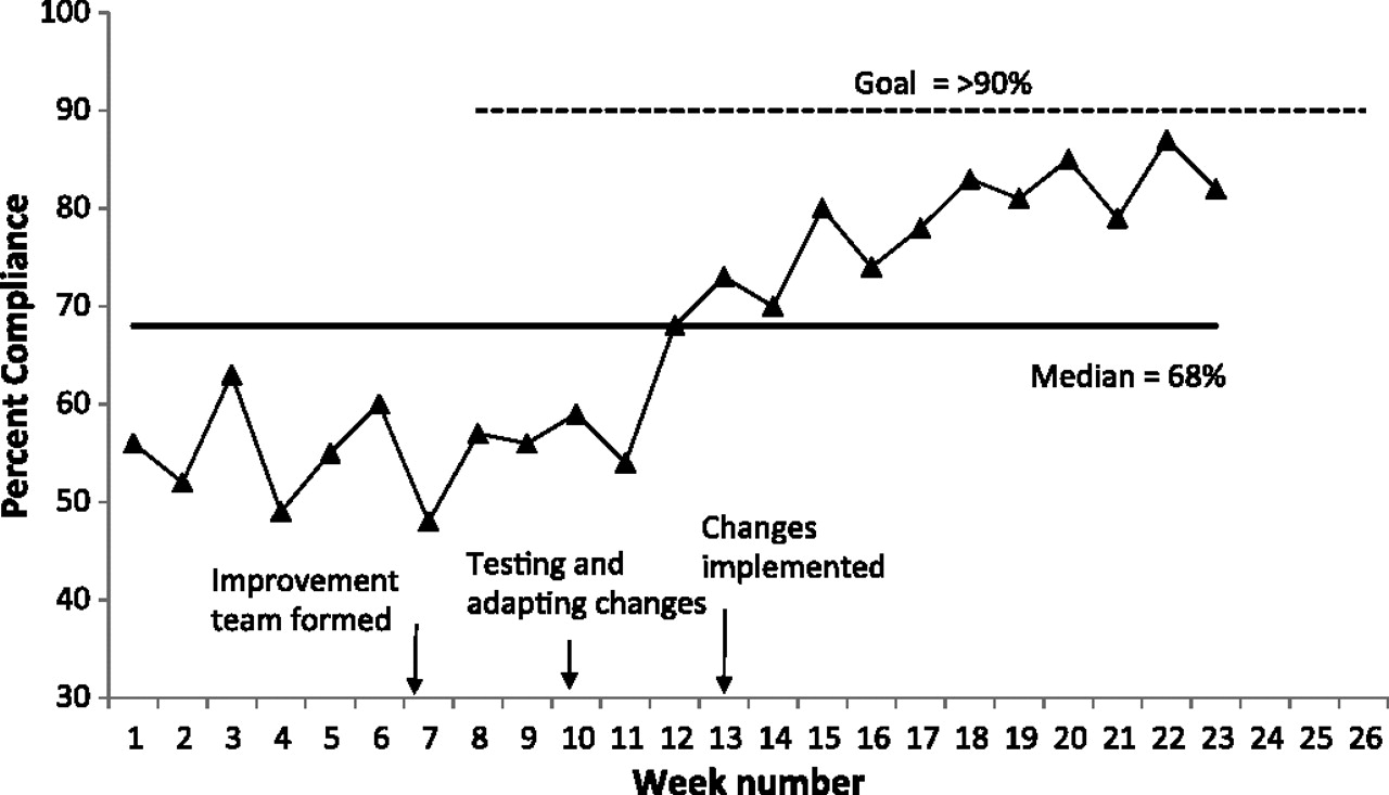
A run chart is a graphical display of data plotted in some type of order. The horizontal axis is most often a time scale (eg, days, weeks, months, quarters) but could also include sequential patients, visits or procedures. The vertical axis represents the quality indicator being studied (eg, infection rate, number of patient falls, readmission rate). Usually, the median is calculated and used as the chart’s centreline. The median is required when using the probability-based rules to interpret a run chart (see below). The median is used as the centerline because (1) it provides the point at which half the observations are expected to be above and below the centerline and (2) the median is not influenced by extreme values in the data. Goal lines and annotations of changes and other events can also be added to the run chart. Figure 1 shows an example of a run chart. As shown in figure 1, the run chart helps us understand and visualise the impact of different interventions and tests of change over time. To determine objectively when these data signal a process improvement, we use the median and run chart rules described in the next section.

Example of a run chart demonstrating compliance with a standard procedure.
The primary advantage of using a run chart is that it preserves the time order of the data, unlike statistical tests of significance that generally compare two or more aggregated sets of data. For example, the summary statistic presented in figure 2 looks like there is improvement in the before to after data attributed to a change in the system. Summary statistics for each of the three units shown in figure 2 where the change was tested produce the same pre-test mean and SD (70 min, 11.3 min) and post-test mean and SD (30 min, 13.15 min). Further, a t-test produced a highly significant result (t22=7.88, p<0.001). The question we want answered, however, is not whether our change was statistically significant but whether the change is associated with a sustainable improvement in each unit where the change was tested. Data from Unit 1 would yield the bar chart in figure 2 and support the conclusion that we have achieved a sustainable improvement. Data from Unit 2 would yield the same bar chart but the data here reveal that improvement was already occurring before the change was tested. Data from Unit 3 would also result in the same bar chart. In Unit 3, the change did result in improvement, however, it was not sustained. Viewing data over time rather than in summary statistics yields richer data and more accurate conclusions for improvement projects.
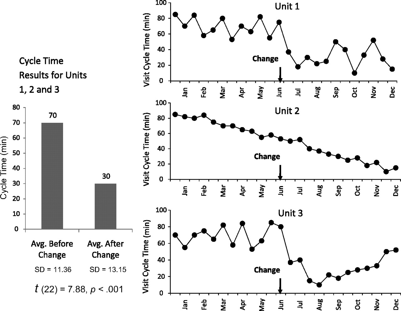
Summary statistics versus time-ordered data. (Each unit has the same 24 data values ordered differently over time.)
Rules to help interpret a run chart
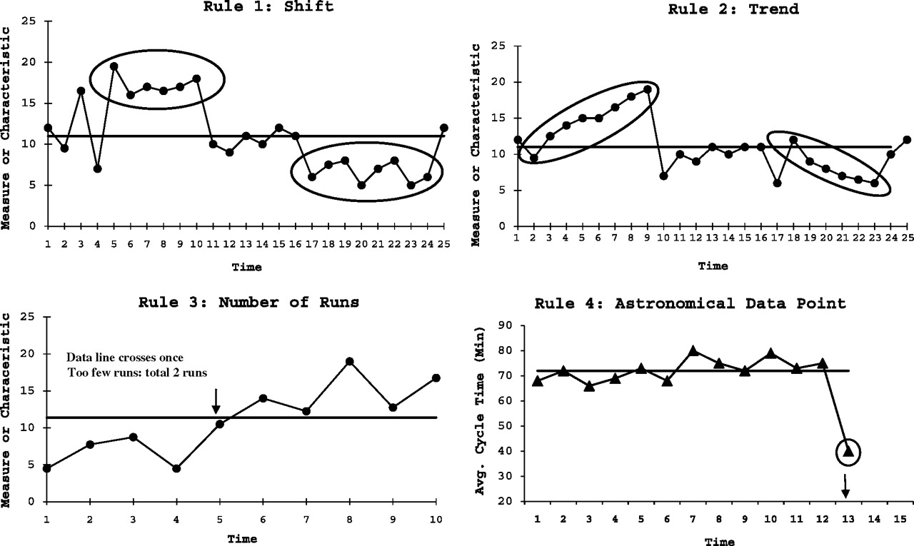
When improvement data are presented in healthcare (eg, clinical reports, dashboards, project updates, and board reports), people will often over- or under-react to a single or most recent data point (and begin tampering, possibly making things worse).8 The terms ‘shift’ and ‘trend’ are often used indiscriminately on a subjective basis as a means for moving a conversation or decision forward, without recognition that statistical definitions of such terms exist and rely on more than a single data point. The three probability-based rules below are used to objectively analyse a run chart for evidence of non-random patterns in the data based on an α error of p<0.05. Although there is nothing magical about the 0.05 level of significance, it provides an objective statistical threshold for whether changes are leading to improvement or degradation in a process and is consistent with typical practice in research. The threshold could be made more or less stringent based on the particular situation, but an agreed upon approach is critical to establish especially if many people are looking at, and acting on, the data being presented. The rules below are appropriate for quality improvement projects (where improvement is planned and expected) and have been shown to be effective in detecting signals in a wide range of healthcare applications.9 10
Rule 1—shift
Six or more consecutive points either all above or all below the median. Values that fall on the median do not add to nor break a shift. Skip all values that fall on the median and continue counting.
Rule 2—trend
Five or more consecutive points all going up or all going down.11 If the value of two or more consecutive points is the same, only count the first point and ignore the repeating values; like values do not make or break a trend.
Rule 3—runs
A non-random pattern is signalled by too few or too many runs, or crossings of the median line.12 A run is a series of points in a row on one side of the median. If only chance is influencing the process being measured with a run chart, then there should be a regularity at which data points go above and below the median to satisfy this condition. Some points can fall exactly on the median line, which makes it hard to decide which run these points belong to. An easy way to determine the number of runs is to count the number of times the line connecting the data points crosses the median and add one. Tabled critical values are used to determine if too many or too few runs exist (see table 1). Figure 3 shows an example of a run chart with too few runs, where it is possible that an intervention is keeping the data from dipping back down below the median which is where it would tend to go if the data were random.
Checking for too many or too few runs on a run chart. Table is based on about a 5% risk of falling the run test for random patterns of data
Rules for identifying non-random signals with run charts.
Rule 4—astronomical point
Used in detecting unusually large or small numbers. An astronomical data point is one that is obviously, even blatantly, different from the rest of the points; all studying the chart would agree the point is unusual. Astronomical points should not be confused with the highest or lowest data points, which every run chart will have. While Rules 1, 2 and 3 are probability based, Rule 4 is subjective and recognises the importance of the visual display of the data in a run chart.
Figure 3 shows the four rules for identifying non-random signals with actual run charts. Of course these rules, like any others, can only be understood in the context in which they are being applied. Nevertheless, having simple and consistent guidelines to distinguish between random variation and non-random signals is an important part of learning from data.
Good technique in using a run chart to learn about the impact of changes is to create an initial median using baseline data. If the baseline data come from a process exhibiting no signals (shift, trend, runs, astronomical data point), extend or ‘freeze’ this initial median into the future.4 By using the baseline data and extending the median into the future, new data are not allowed to influence the initial median. Any changes in the new data stand out against the baseline median more clearly allowing for more accurate detection of signals of improvement (the probability-based rules are relative to this median value). This is particularly important as we try to understand the impact of different changes to a system over time.
With a small amount of data, the median (and thus the above rules) may not be useful. The shift and run rules require more than 10 points before they are applicable. But the user should decide when to calculate the median when starting the run chart. There are many applications (eg, patient monitoring of annual PSA tests) where the run chart is useful with just three or four data points in order to get an early indication of central tendency and trend. In the case of PSA testing, we usually do not have the luxury of many data points but still need to learn from the data to help form a clinical decision.
Limitations
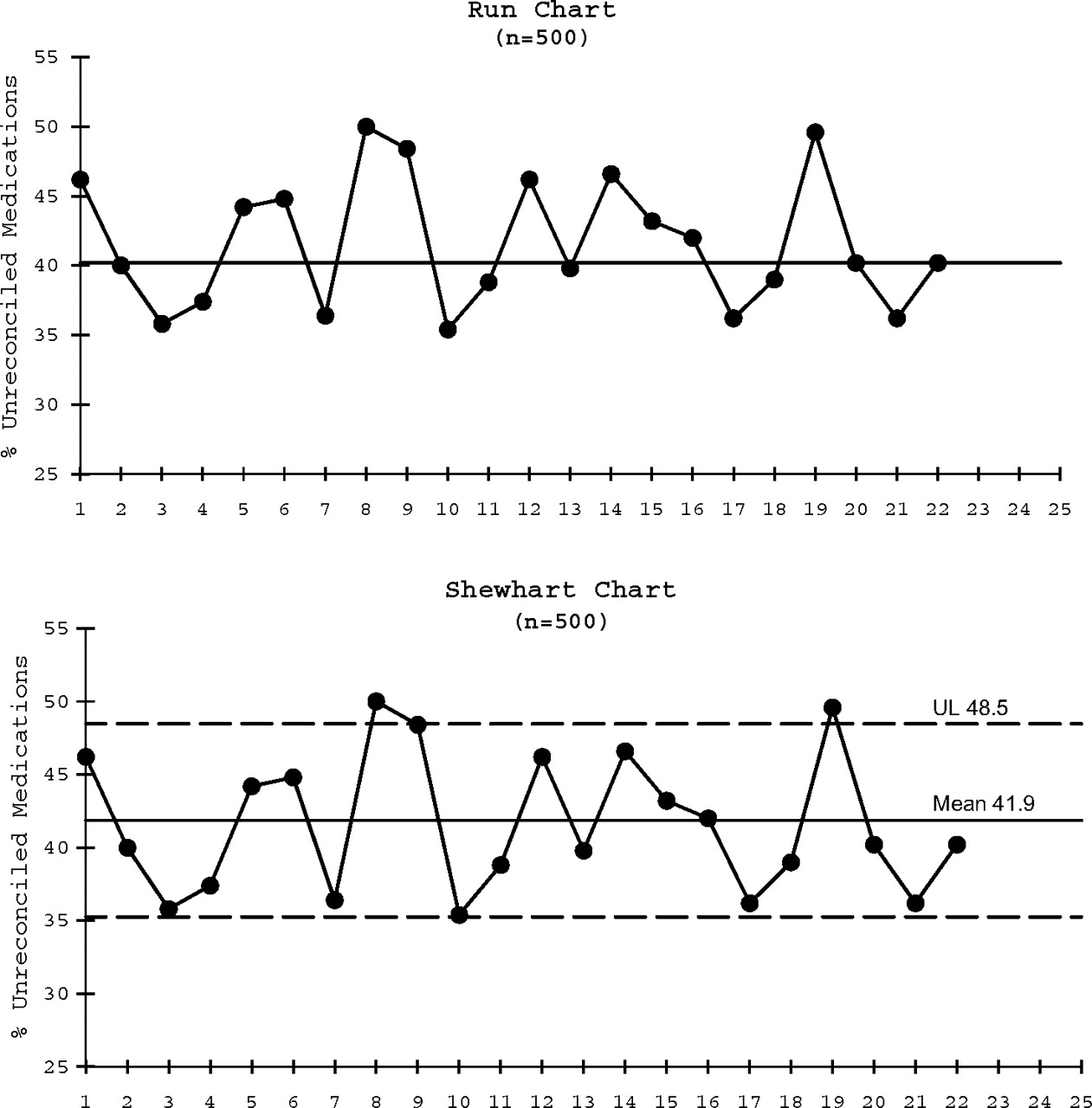
As with any analytical tool, there are limitations to run charts. First, run charts are designed for the early detection of signals of improvement or degradation in a process over time. However, run charts are not capable of determining if a process is stable (as defined by Shewhart in relation to control charts only). Using control chart language with run charts can create confusion because the two methods include different rules for identifying non-random patterns. Shewhart charts identify deviations from the centreline (mean, not the median) using control limits. Figure 4 shows a run chart with no signals of non-random variation. Some might be tempted to declare this process stable. These same data when displayed on the appropriate Shewhart chart, however, reveal special causes. This process is not stable. Determining if a process is stable is important to understand if improvements have been sustained and to predict future performance which will impact decision-making. To determine if a process or system is in a stable state, a Shewhart (control) chart is needed.4 5 13 In using run charts, we recommend avoiding the terms special and common cause and stable or unstable, reserving their use for Shewhart (control) charts.

The same data analysed using a run chart and a Shewhart chart.
Second, there are situations in healthcare settings where the data are discrete and can make use of the run chart rules more complex. For example, if 50% or more of the data on a run chart represents the absolute extreme values on the scale (eg, 0 or 100% on a percentage scale), the criteria for detecting a non-random statistical signal using the median cannot be applied. In these cases, the data will not yield a useful median making application on the rules useless. The median will be the extreme absolute value itself (0% or 100%). In these cases, one could use the mean as the centerline (if no extreme data values were observed). Another option in this case would be to display the time (eg, days) or workload (eg, number of cases) between the event on the run chart, plotting each time an event occurs.4 5 More time or workload between undesirable events may be a sign of improvement. Although beyond the scope of this paper, strategies to modify run charts to address these types of unusual data situations are available.4 6
Third, as was shown in the example in figure 2, run charts require judgement and understanding of the context and situation in which the data are collected and presented because it is ultimately the context of a situation that drives our predictions and goals. Lastly, healthcare providers and professionals are largely trained in aggregate summary statistics and hypothesis testing paradigms which focus often on larger amounts of data at distant intervals. Using run charts, and other statistical process control tools, requires more regular monitoring and data collection for the purposes of better understanding the voice of the process (and sometimes the voice of the patient). Those leading improvement efforts using such tools should recognise the potential for more frequent data collection over shorter time periods (see box online).
Conclusion
Run charts are easy to construct and simple to interpret. Since improvements are made over time, plotting data over time using a run chart is a fundamental method to evaluate the success of improvement efforts in an objective way. The run chart is therefore an important tool with wide potential application in healthcare improvement. Some healthcare organizations use run charts as part of their process improvement efforts presently, but far more do not. Without some objective and simple measure of change and improvement we are left with speculation, intuition, subjective assessments or the application of inappropriate statistical approaches. There is growing recognition that quality measurement tools, such as run charts, are important for research and planned experimentation that informs how we think about and understand the systems and outcomes we want to improve.6 It has long been advocated that aggregate summary statistics always include measures of data in their natural time order as a means of acquiring knowledge.13 14
The value of a run chart is its simplicity and versatility in letting us learn from our data. By adding some probability-based rules to aid interpretation, we get a picture of the process over time and a method to systematically identify non-random signals. The information provided in this paper provides the necessary information to begin exploring and using run charts as an analytical tool for improvement projects in healthcare.
Supplementary materials
Web Only Data
Files in this Data Supplement:
Footnotes
Competing interests None.
Provenance and peer review Not commissioned; externally peer reviewed.